Case Study
Simplified navigation in Business Banking

About Danske Bank & District
Largest Danish Bank and Major Retail Bank in the northern EU region
Founded in 1871, Headquartered in Copenhagen, Denmark. Employs 22,000 people currently.
5 Million Retail Customers, 35% Corporate market Share in the Nordics
A market leader across the Nordics, serving millions of personal customers alongside a substantial corporate and institutional client base.
District is the Bank's flagship B2B web platform
District is the digital banking platform corporate and business clients use to manage payments, accounts, cards and day-to-day finances in one place.
The Project Scope
Identify areas of improvement for District's navigation by conducting qualitative and quantitative research. Design, test and implement changes based on research insights.
I as a user...
Have a hard time navigating District and finding what I'm looking for.
I as a user...
Feel like that using District is an overwhelming experience with all the available options.
I as a user...
Want to measure, validate and fix problems around District's navigation.
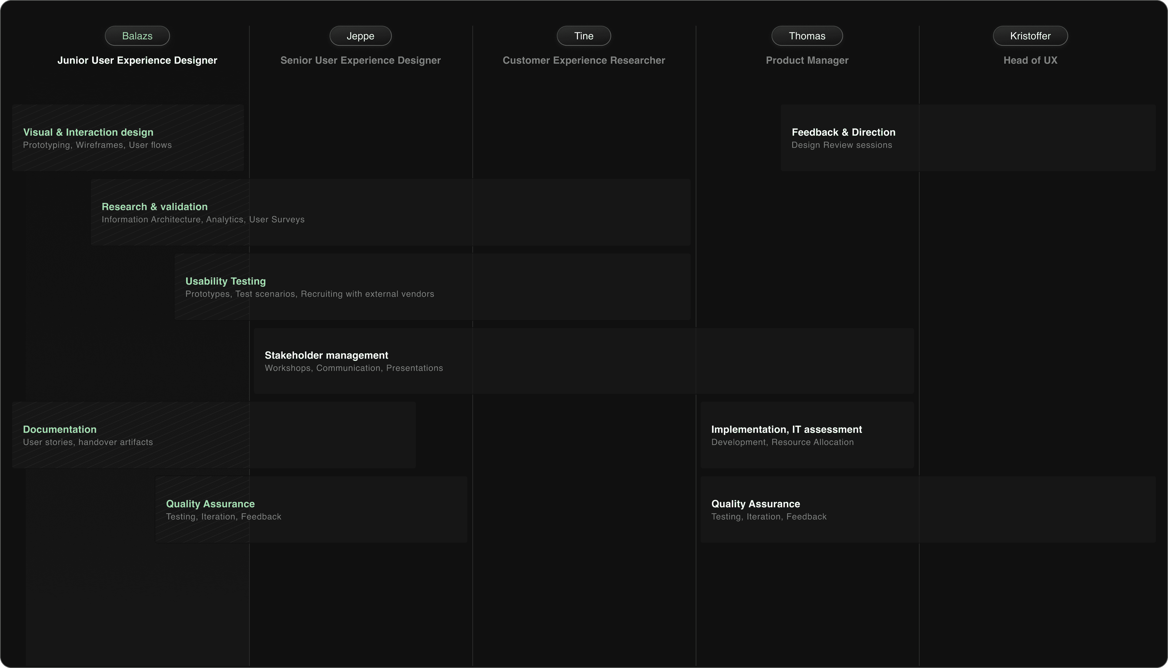
My role as a Junior Product Designer was to create interaction design flows, prototypes and mockups. Furthermore I assisted in analyzing research data from surveys, open comments and analytics to create actionable insights that formed the basis of our business case.
UX Research Methods our project was based on
Analyzing time spent per workspace
To identify the most important use cases for our users we've explored the time spent per workspace metric. This gave us a clear picture of the heavy traffic some areas see.
Surveying user satisfaction
We have an automated survey in place that is sent out each month. The survey provides qualitative and quantitative insights.

Tracking user paths
We've explored how different user segments navigate District with the help of Adobe Analytics, observing what are the common navigation pathways and how our IA matches that.
Customer Support Reports
We've worked together with the Customer Support Organization to continuously collect and analyze feedback given by users. Visited the CS center and listened in on customer calls in relation to district.
1:1 Usability Tests
Conducted one on one usability tests in two rounds. Round one was conducted in-house and round two outsourced to an agency. Identified important usability flaws in the concept we've addressed afterwards.
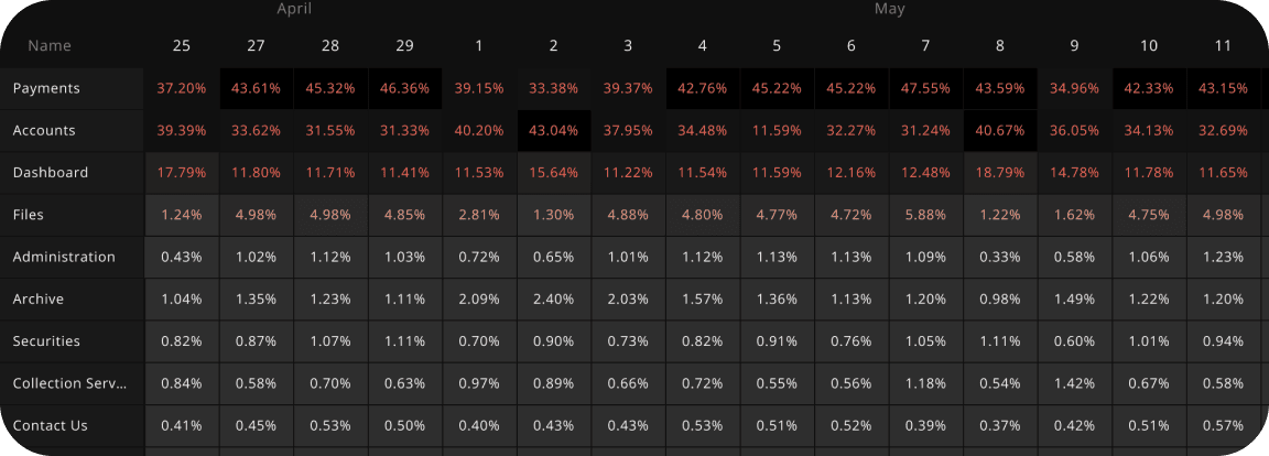
Percentage of visits per Workspace per day in District, across all user segments and countries. Data source: Adobe Analytics Tracking for District
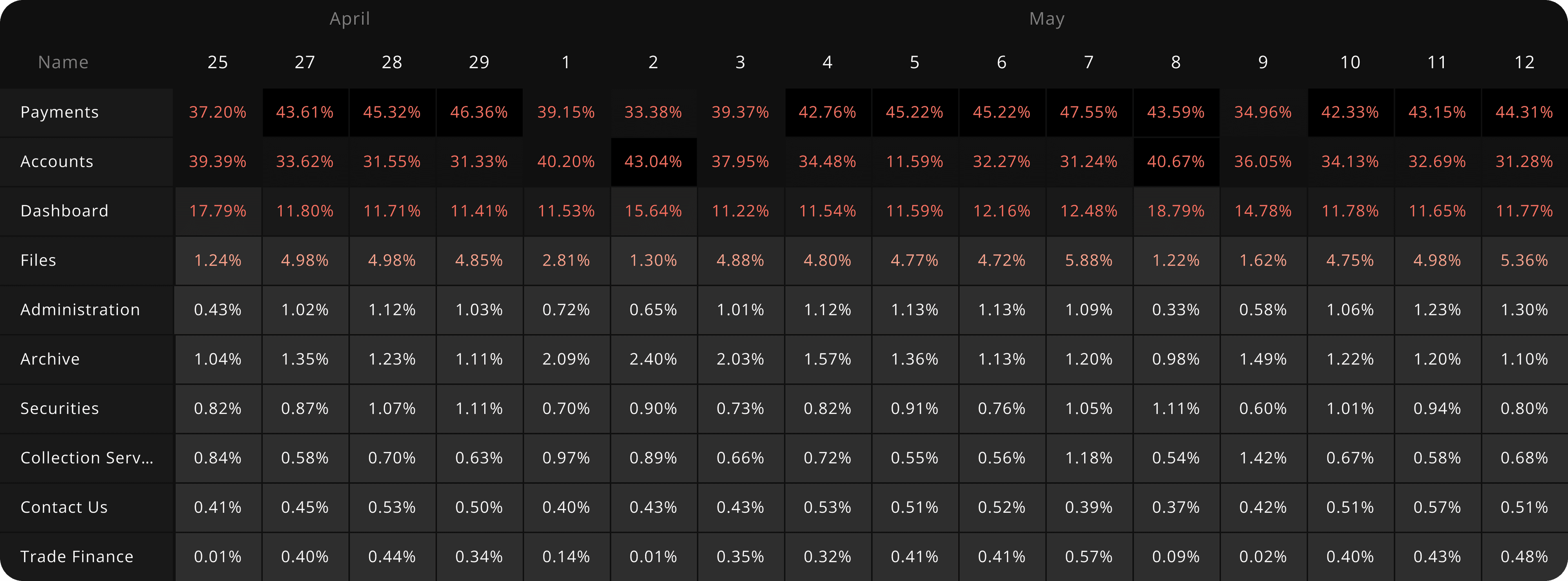
Only a handful of workspaces receive 90% of the global traffic daily.
It's clear that much of the workspace traffic is centered around payments, accounts, the dashboard and files. District's current navigation doesn't make it easy for the users to find these workspaces, especially if many modules are enabled on the user's account.
High impact outlier workspaces that don't fit this paradigm shouldn't be overlooked.
Some workspaces like markets and trading receive much less traffic than accounts for example when looking across all workspaces, this is because they are not part of District's base tier. While we want to make navigation easier for the majority of our users, we also don't want to make changes that will negatively affect high impact users.
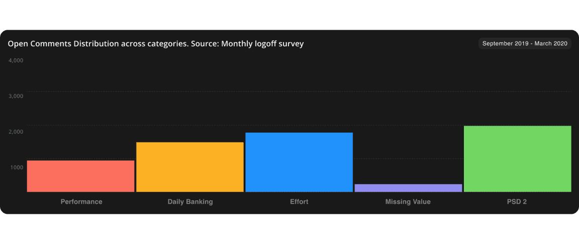
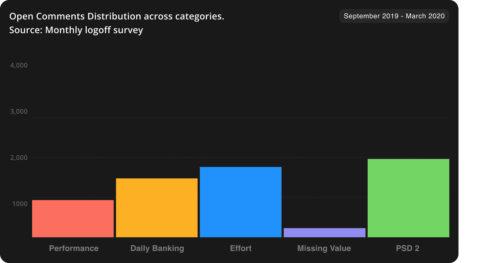
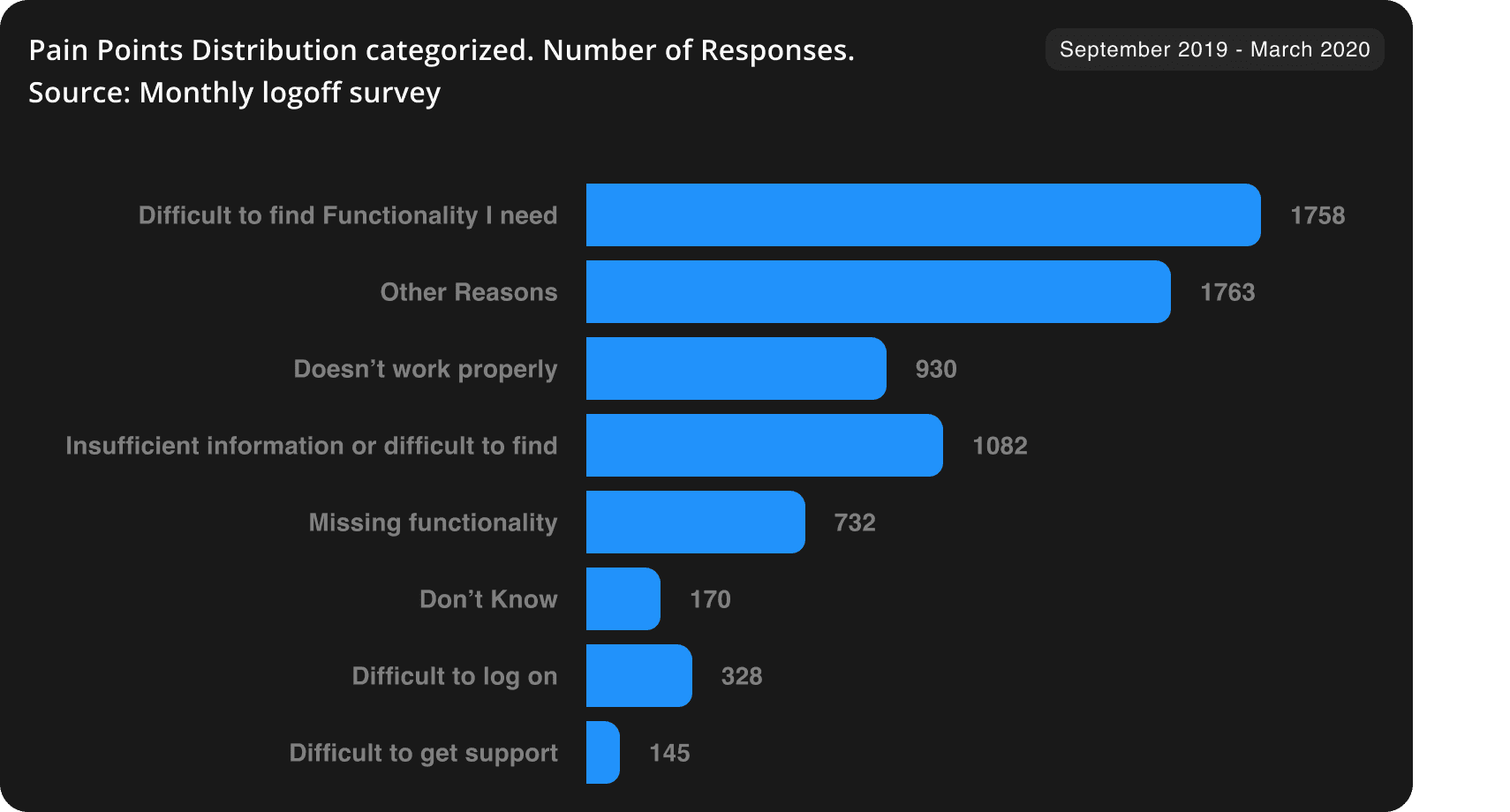
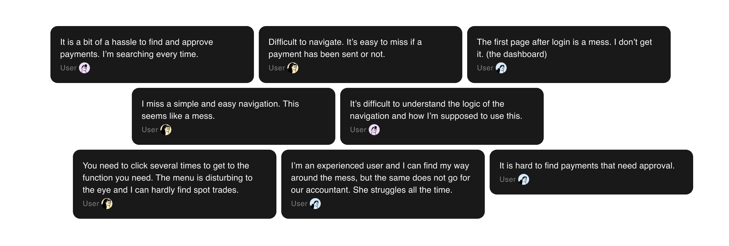
Open Comments and Pain Points categorization. Source: Monthly logoff survey
Meet the Redesigned Side Navigation
Instead of the navigation opening and closing on hover, we made it so the navigation now stays open at all times
This helps our users navigate and reduces the cognitive load they have to process when looking through navigation options.
Developed a new feature that lets users pin favorite actions and workspaces
We have enabled our users to pin actions and workspaces directly to their navigation, creating shortcuts to their most needed functions.
Reorganized and highlighted most frequent navigation elements
We have grouped the workspaces that see the most frequent use at the top of the navigation. Additionally, we emphasized them by using supporting icons.
Removed 80% of icons from workspace the navigation and replaced the remaining with simpler, less confusing icons
Our previous icon set was really complicated and had issues with readability when viewing from the distance. We've replaced the icons with a new, simpler set.
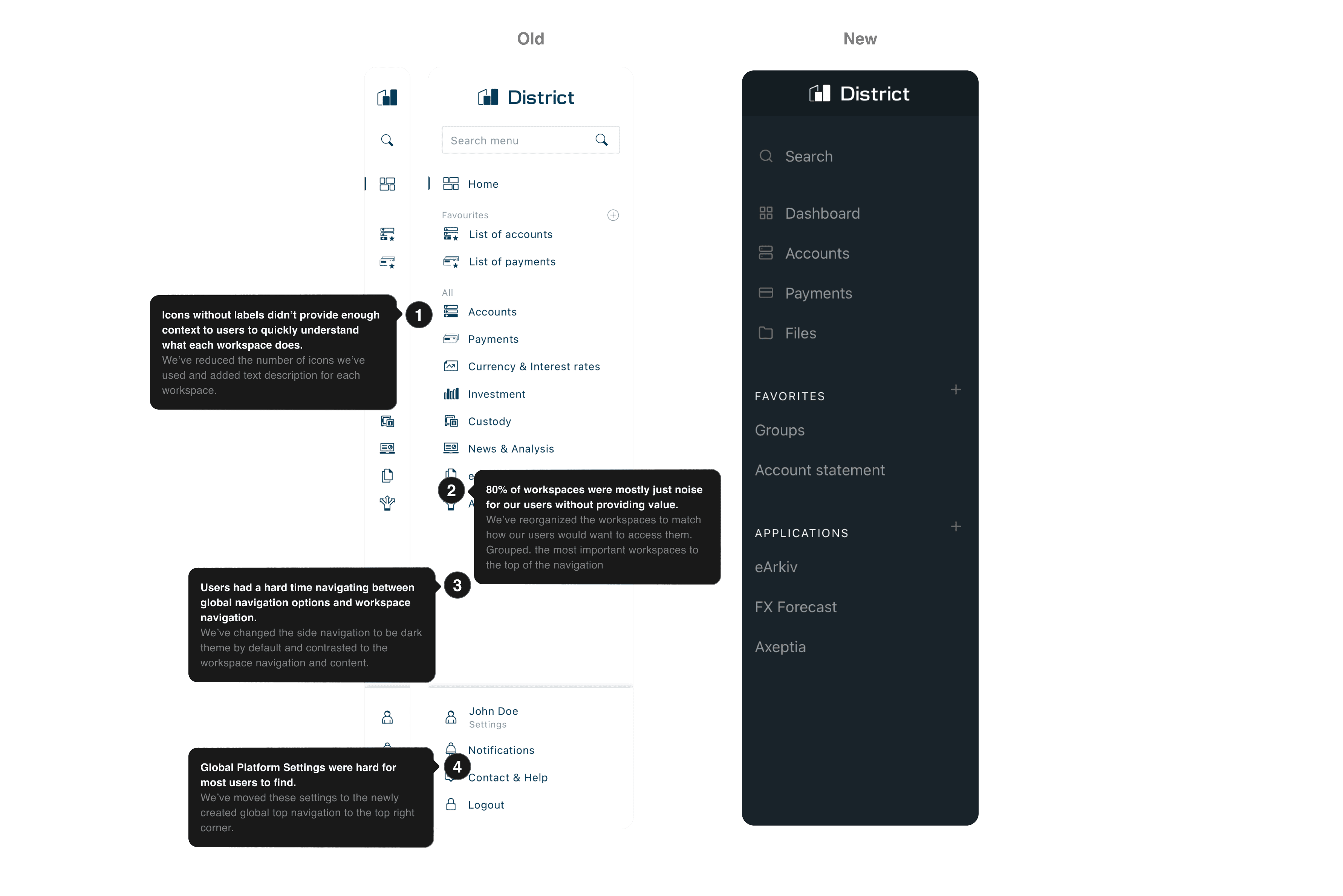
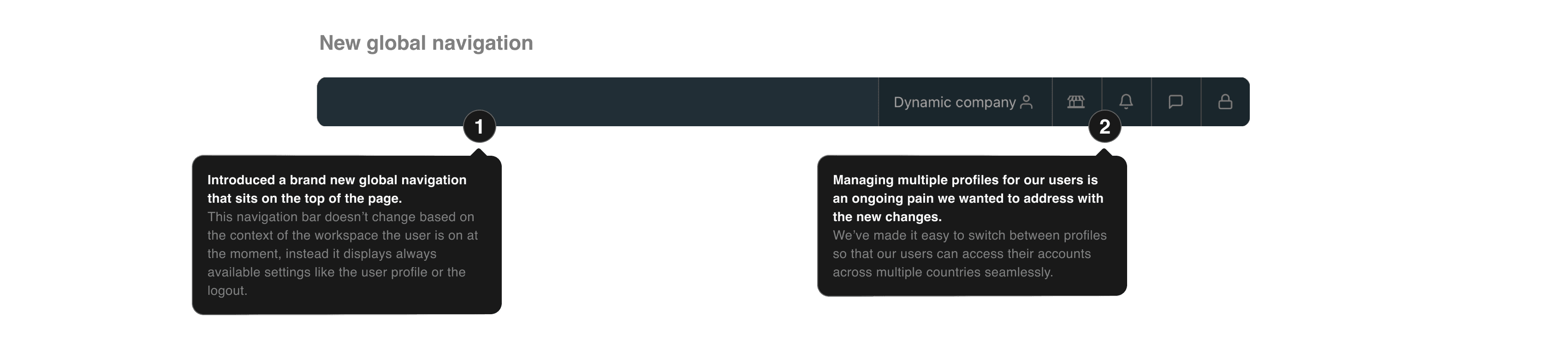
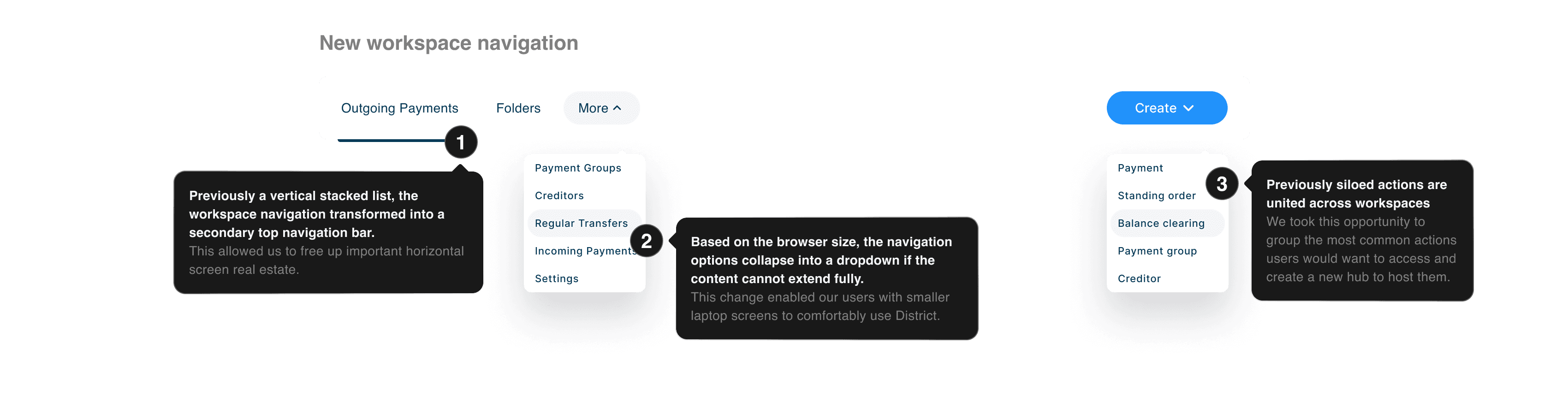
Top navigation introduced as secondary layer
Expanded workspace navigation
The flexible secondary navigation is fully customizable. Workspace developers can choose to add groups and additional drop downs to the view.
Global actions grouped in the top right corner
The primary top navigation is now home to the platform functions, where users can access their account details, billing, logout and more
Create actions
Dropdown displays actions across workspaces, breaking down organizational silos we have created
Usability Testing
−
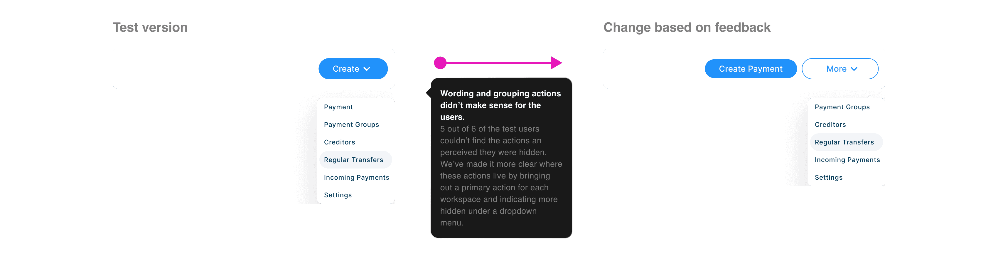
Icons in the top bar were still confusingSome users felt action items were hiddenOnboarding tooltips didn't receive attentionIt's still hard to find seldom used actionsSmall data set to evaluate+
Overall less icons on the platformSimple navigation and more structureUsers felt ready to use DistrictThe side bar felt natural to the usersAll users were able to complete their tasksCopywriting and grouping of actions didn't work well.
We've changed the 'Create' actions concept slightly to make it more understandable for the user, by displaying a primary action with its original label and folding the rest into a dropdown with a secondary button.
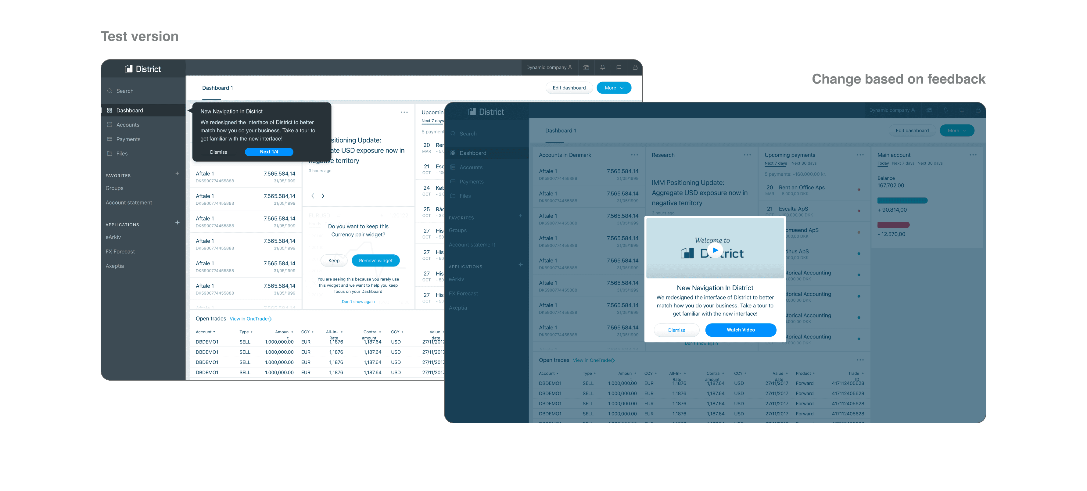
Popups with guided tour got very little attention. We've augmented the onboarding with a video walkthrough.
Difficulties in later testing stages showed that users could benefit from a thorough walkthrough, and dismissing the popups after login went against that.
Core Team Members
Balazs Korcsog - Junior UX Designer
Tine Hetland Kann - Senior CX researcher
Jeppe Henckel - Senior UX consultant
Support & Feedback
Kristoffer Solberg - Head of UX
Evangelos Chaviaris - Lead UX
Morten Ols - Senior Designer
Milla Klysner - Digital designer
Thomas Bech - Product owner
Lærke Gerstrand - IT student
Thank You For Reading!
Balazs K.
Anthony Boyd — Mockups, Alexander Käßner — Inspiration